Brand Partner
Positioning | Identity Systems | Web Experiences
*
GUI—DE—FREITAS
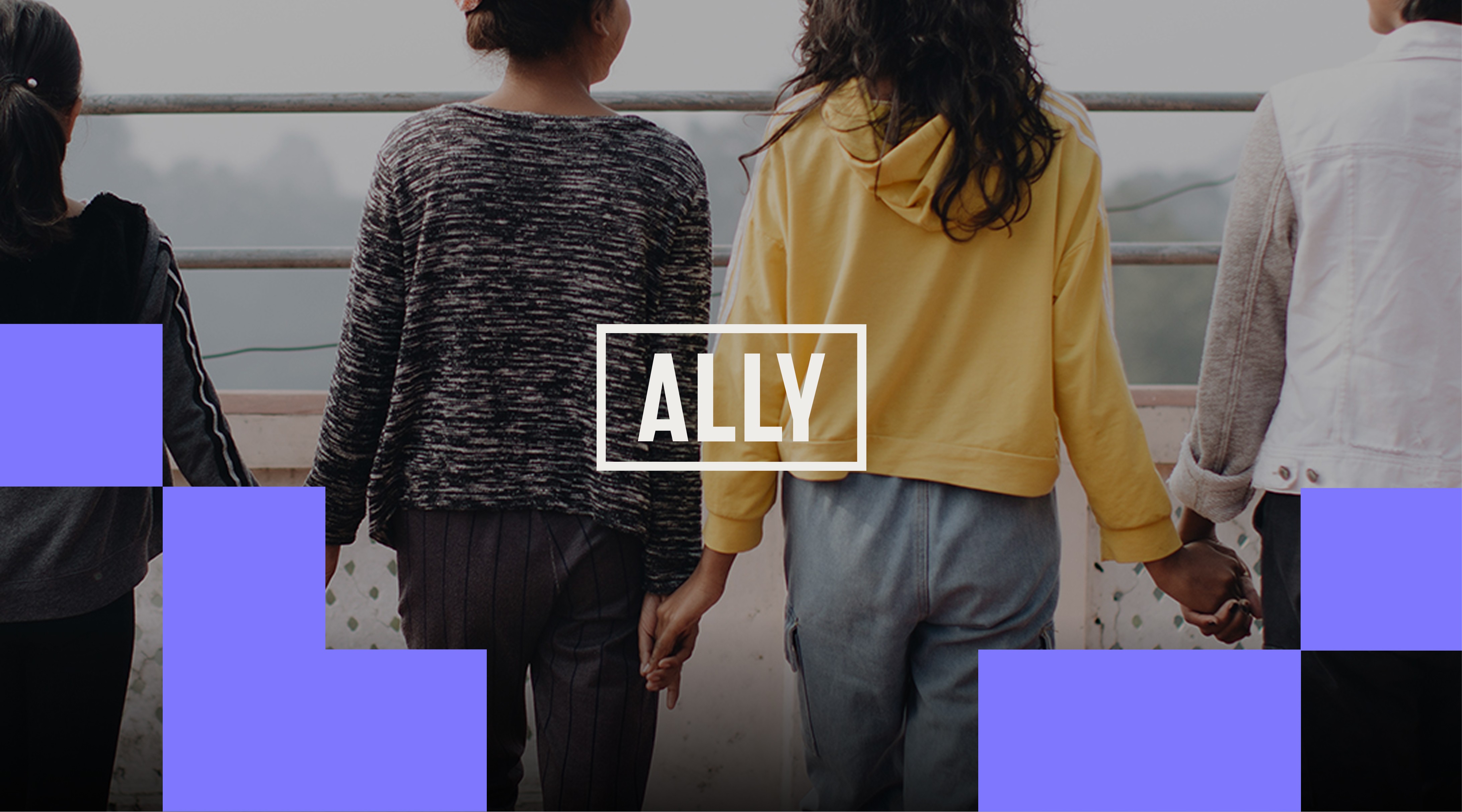
Ally Global Foundation
Ally Global Foundation
Redesigning a global nonprofit identity to support clarity, credibility, and long-term impact.
Redesigning a global nonprofit identity to support clarity, credibility, and long-term impact.
Redesigning a global nonprofit identity to support clarity, credibility, and long-term impact.
Agency Lead:
Veto Creative Agency
Role:
Independent Brand Design Partner
Scope:
Brand Redesign
Identity System
Brand Expressions
Web & Digital Direction
Content Navigation:
A global mission requires a brand built to carry its weight.
A global mission requires a brand built to carry its weight.
A global mission requires a brand built to carry its weight.
Ally Global Foundation entered a new strategic phase.
Under Veto’s repositioning strategy, the organization expanded from emphasizing individual restoration projects to communicating a comprehensive model — addressing prevention, intervention, restoration, and reintegration in the fight against child sex trafficking and exploitation.
This shift required more than updated messaging.
The brand needed to express greater institutional maturity, global reach, and operational credibility — while preserving the human core of its mission.
My role was to redesign the identity and build a visual language system capable of translating that positioning into a cohesive, scalable brand presence.

The previous identity was consistent and well managed.
What changed was how Ally’s new direction needed to be represented and reflected.
The new direction required the brand to:
- Signal expanded global scope
- Strengthen perceived credibility with donors and partners
- Maintain emotional resonance without relying on nonprofit convention
- Preserve equity while evolving meaningfully
- Scale coherently across multiple programs and touchpoints
This was a brand redesign rooted in strategy — not a cosmetic refresh.
Previous Branding
Previous Branding

As the start point, the logo was refined for clarity and strength — maintaining recognizable elements while improving readability and balance.
The original logo was composed by a stacked "AL" above "LY" within an outlined frame. While distinctive, the vertical construction fragmented the word and reduced immediate readability.
For a global organization, legibility is strategic.
“Ally” represents solidarity, protection, partnership — the name carries meaning beyond identification.
The redesigned wordmark restored horizontal clarity while preserving the frame as a core equity device. This evolution strengthened recognition, memorability, and authority — without disconnecting from the brand’s past.


Beyond the logo, a comprehensive system was introduced to align expression with the repositioning around — Protect Childhood.
The system operates across three integrated layers:
Beyond the logo, a comprehensive system was introduced to align expression with the repositioning around — Protect Childhood.
The system operates across three integrated layers:
Beyond the logo, a comprehensive system was introduced to align expression with the repositioning around — Protect Childhood.
The system operates across three integrated layers:


— 1. Modular Framework
A disciplined, pixel-based grid forms the structural backbone of the identity.
It enables scalable layouts, clear hierarchy, and consistent rhythm across digital, print, campaign, and environmental applications. The framework ensures flexibility without fragmentation.
Structure creates cohesion.


— 2. Colour Architecture
The colour system evolved strategically.
The previous teal was retained to preserve brand equity and visual recognition. Purple was lightened to match the system’s vibrancy. Yellow, previously program-specific, became part of the core palette. A new orange introduced additional expressive flexibility.
Together, teal, purple, yellow, and orange support the organization’s three pillars — Prevent. Provide. Prepare.
A warm light sand anchors the system with openness. A deep off-black provides tonal control and authority.
The result balances seriousness with humanity.

— 3. Typography as Authority
Typography became structural.
A clear hierarchy allows messaging and impact metrics to communicate with confidence, turning data into visible proof of effectiveness.
Large-scale statements such as "Protect Childhood" operate seamlessly within the system — reinforcing clarity and conviction.

With the system established, the repositioning came to life through bold executions.
Large-scale typography, close-cropped portraiture, and disciplined colour blocking created immediacy without sensationalism.
The retained frame device evolved into a broader visual metaphor for protection — reinforcing the mission both symbolically and structurally .
The brand no longer blends into nonprofit familiarity. It asserts presence.


The redesign was deployed across a coordinated ecosystem.
Over 50 concept applications were developed across digital, print, campaign, environmental, and donor touchpoints, including:
- Website and digital direction
- Donor and program overview materials
- Fundraising toolkits
- Event and environmental graphics
- Office installations and merchandise
Each touchpoint reinforced consistency, recognition, and strategic clarity. Scalability was built in — not added later.


The result was an identity that aligns strategy, expression, and intention — providing a stable foundation the organization can grow into over time.
It provides:
- Greater global legibility
- Stronger institutional credibility
- Clear representation of mission and pillars
- Structured flexibility across programs
- A scalable foundation for long-term growth
For global nonprofits operating in high-stakes spaces, clarity is credibility.
I help founders and teams that are serious about their business growth to leverage brand power for what's next: a launch, a pitch, or a new phase of growth.
See Other Projects

Greencoast Power
Repositioning a solar energy and electrical company through brand and web transformation.
Sector: Renewable Energy & Electrical Infrastructure

Nature's Touch
Designing a scalable web experience for the world's largest supplier of frozen fruits and vegetables.
Sector: Food Manufacturing (CPG)
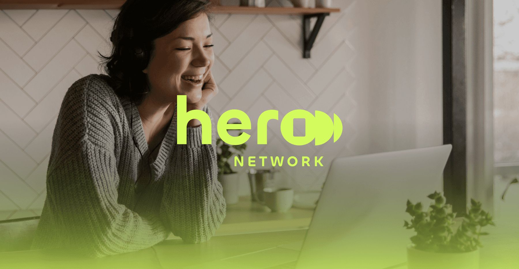
Hero Network
Developing a foundational brand system and visual language for a media-tech storytelling venture.
Sector: Media-Tech
Trinity Western University
Designing a cohesive institutional brand system and visual language for a leading Christian university.
Sector: Higher Education
Veto Creative Agency
Repositioning and redesigning a creative agency brand to elevate perception, clarity, and competitive positioning.
Sector: Advertising & Creative Services
See Other Projects
Greencoast Power
Repositioning a solar energy and electrical company through brand and web transformation.
Sector: Renewable Energy & Electrical Infrastructure
Nature's Touch
Designing a scalable web experience for the world's largest supplier of frozen fruits and vegetables.
Sector: Food Manufacturing (CPG)
Hero Network
Developing a foundational brand system and visual language for a media-tech storytelling venture.
Sector: Media-Tech
Trinity Western University
Designing a cohesive institutional brand system and visual language for a leading Christian university.
Sector: Higher Education
Veto Creative Agency
Repositioning and redesigning a creative agency brand to elevate perception, clarity, and competitive positioning.
Sector: Advertising & Creative Services
Every brand and growth stage is different.
Transformation starts with a conversation.
I collaborate with founders, teams, and agencies across branding, design and web experiences.
© 2026 . Gui de Freitas — Proudly 🇧🇷 Brazilian by birth, 🇨🇦 Canadian by path. Collaborating with brands and teams worldwide 🌎.