Brand Partner
Positioning | Identity Systems | Web Experiences
*
GUI—DE—FREITAS
Greencoast Power
Greencoast Power
Repositioning a solar and electrical services company through identity and digital transformation.
Repositioning a solar and electrical services company through identity and digital transformation.
Repositioning a solar and electrical services company through identity and digital transformation.
Partnered with:
Ian Bray - Copywriting
Role:
Brand & Web Partner
Scope:
Brand Identity
Web Strategy
UX & UI Design
Website Implementation
Content Navigation:
Aligning Perception with Operational Strength in the evolving energy landscape.
Aligning Perception with Operational Strength in the evolving energy landscape.
Aligning Perception with Operational Strength in the evolving energy landscape.
Greencoast had built real capability in solar and electrical services across Vancouver Island. The business was experienced, technically strong, and trusted across residential, commercial, and public-sector projects. But their brand didn’t reflect that maturity.
In a category where trust and credibility influence contracts, perception directly impacts opportunity. They weren’t lacking expertise. They were lacking alignment between who they were and how they showed up.

The existing identity and website undersold the company.
The visual language felt inconsistent.
The navigation lacked clarity.
The messaging didn’t clearly differentiate their solar and electrical capabilities.
As competition increased, looking established wasn’t optional — it was necessary. The risk wasn’t aesthetic. The risk was being perceived as smaller than they were.

As part of the strategy to increase clarity and credibility, looking into its brand identity and visual language became a pre-requisite to elevate its perceived value and reflect the strength of its operation.
The logo was redesigned to feel modern and durable — not trendy. Its form references solar energy and electrical precision, while remaining simple enough to scale across vehicles, uniforms, and digital platforms.
The visual language was tightened:
- A refined color system balancing energy and trust
- Clear typographic hierarchy for readability and authority
- Structured compositions built for clarity under heavy content
Every decision aimed at one outcome: Make the brand feel as solid and dependable as the work behind it.


The website solution started with structure.
Before redesigning anything, we clarified the information architecture, defined a clearer hierarchy between services, organized content to educate without overwhelming, and simplified the user journey — especially for urgent inquiries and quote requests.
The goal was simple: Make the experience as straightforward and professional as the service itself. From there, the solution evolved to support that clarity.


The result was a transformation that aligned perception with capability.
Greencoast now presents itself with clarity, confidence, and professionalism — better positioned to compete for larger projects and represent its expertise at a higher level.
The business didn’t change. How it shows up did.
The result was a transformation that aligned perception with capability.
Greencoast now presents itself with clarity, confidence, and professionalism — better positioned to compete for larger projects and represent its expertise at a higher level.
The business didn’t change. How it shows up did.
The result was a transformation that aligned perception with capability.
Greencoast now presents itself with clarity, confidence, and professionalism — better positioned to compete for larger projects and represent its expertise at a higher level.
The business didn’t change. How it shows up did.

I help founders and teams that are serious about their business growth to leverage brand power for what's next: a launch, a pitch, or a new phase of growth.
See Other Projects
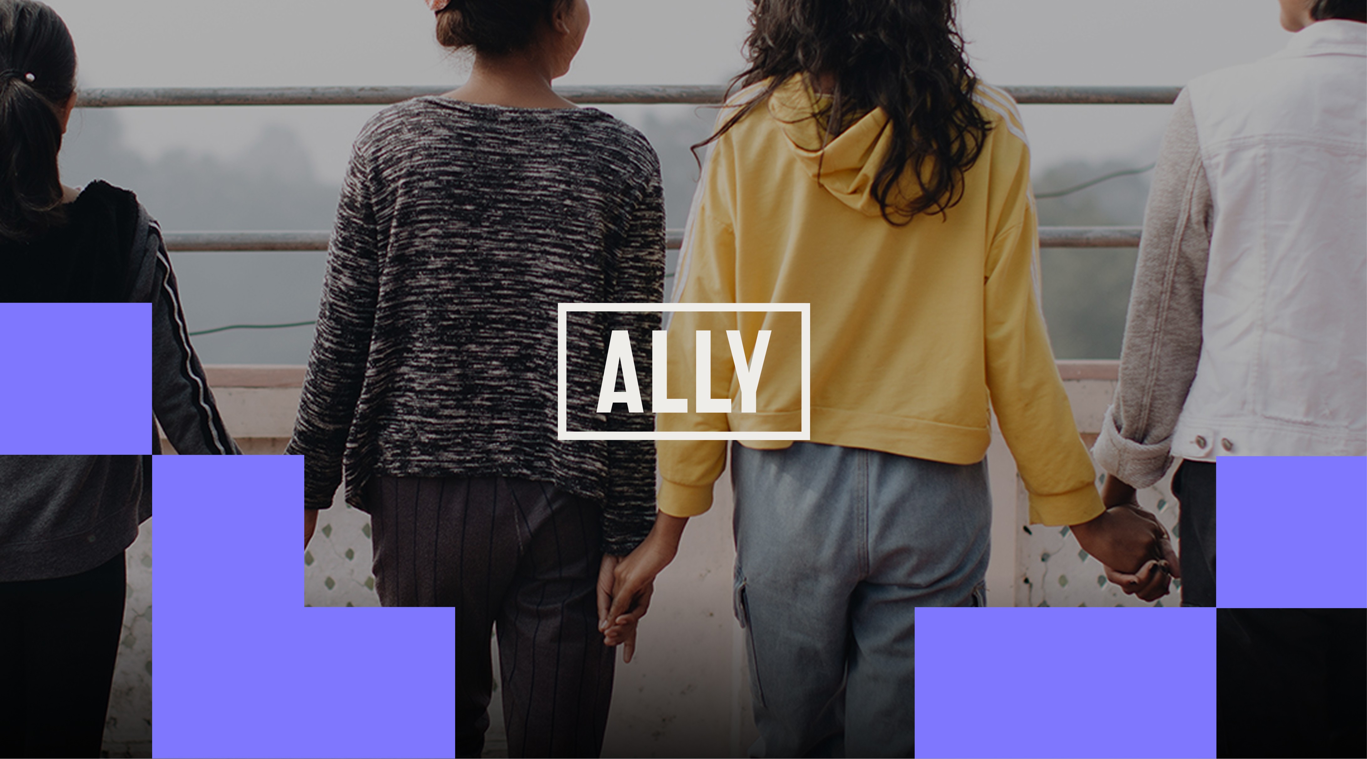
Ally Global Foundation
Redesigning a nonprofit brand identity system to reflect its new positioning and global presence.
Sector: Nonprofit & Social Impact

Nature's Touch
Designing a scalable web experience for the world's largest supplier of frozen fruits and vegetables.
Sector: Food Manufacturing (CPG)
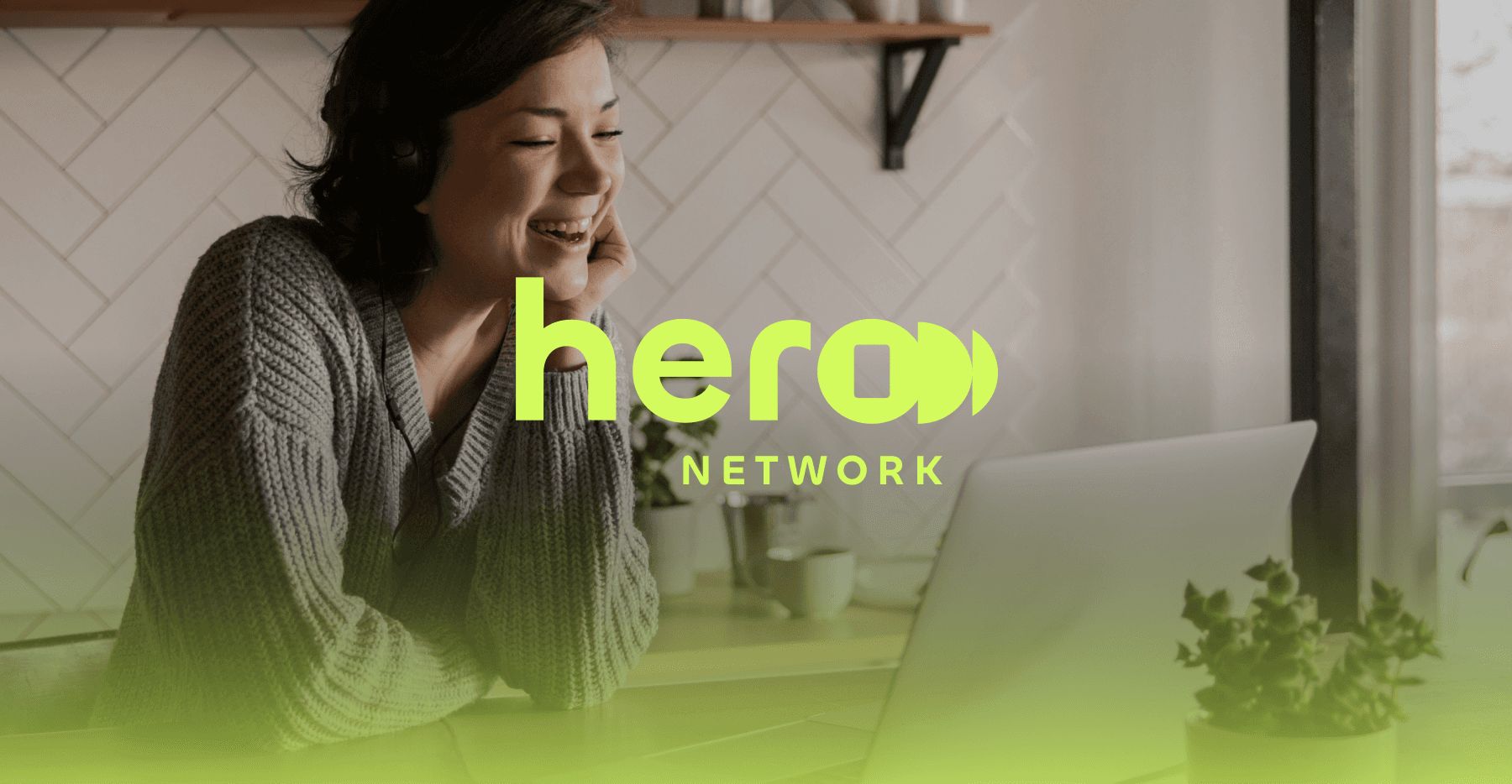
Hero Network
Developing a foundational brand system and visual language for a media-tech storytelling venture.
Sector: Media-Tech
Trinity Western University
Designing a cohesive institutional brand system and visual language for a leading Christian university.
Sector: Higher Education
Veto Creative Agency
Repositioning and redesigning a creative agency brand to elevate perception, clarity, and competitive positioning.
Sector: Advertising & Creative Services
See Other Projects
Ally Global Foundation
Redesigning a nonprofit brand identity system to reflect its new positioning and global presence.
Sector: Nonprofit & Social Impact
Nature's Touch
Designing a scalable web experience for the world's largest supplier of frozen fruits and vegetables.
Sector: Food Manufacturing (CPG)
Hero Network
Developing a foundational brand system and visual language for a media-tech storytelling venture.
Sector: Media-Tech
Trinity Western University
Designing a cohesive institutional brand system and visual language for a leading Christian university.
Sector: Higher Education
Veto Creative Agency
Repositioning and redesigning a creative agency brand to elevate perception, clarity, and competitive positioning.
Sector: Advertising & Creative Services
Every brand and growth stage is different.
Transformation starts with a conversation.
I collaborate with founders, teams, and agencies across branding, design and web experiences.
© 2026 . Gui de Freitas — Proudly 🇧🇷 Brazilian by birth, 🇨🇦 Canadian by path. Collaborating with brands and teams worldwide 🌎.