Brand Partner
Positioning | Identity Systems | Web Experiences
*
GUI—DE—FREITAS
Veto Creative Agency
Veto Creative Agency
Transforming a creative studio into a globally positioned, emotion-driven agency.
Transforming a creative studio into a globally positioned, emotion-driven agency.
Transforming a creative studio into a globally positioned, emotion-driven agency.
Agency Lead:
Veto Creative Agency
Role:
Creative Director & Lead Brand Designer
Scope:
Brand repositioning
Identity System
Visual Language
Web & Digital Direction
Spatial Activation
Brand Launch
Content Navigation:
An agency’s brand should reflect the level at which it intends to be perceived.
An agency’s brand should reflect the level at which it intends to be perceived.
An agency’s brand should reflect the level at which it intends to be perceived.
Veto was entering a new phase — transitioning from a studio model to an international creative agency, expanding its strategic capabilities and global ambition.
The shift required more than updated visuals.
The brand needed to:
- Reflect the full breadth of its expertise
- Elevate perceived value within competitive markets
- Strengthen credibility with larger clients and partners
- Clarify its distinct positioning within the industry
The objective was to align presence with potential — ensuring the agency’s identity communicated the level at which it intended to operate.
Veto’s work demonstrated creative strength, but its brand did not fully express its strategic depth and international intent.
The agency needed to evolve from:
- Boutique perception → Confident global presence
- Execution-led narrative → Emotion-informed strategic leadership
- Portfolio showcase → Clear market positioning
The new brand direction and identity had to embody that balance — disciplined, but expressive. Strategic, but emotionally-driven.


The repositioning clarified the agency’s differentiator: the deliberate integration of emotional intelligence and strategic direction.
Inspired by a famous quote by Maya Angelou, "People will forget what you said, people will forget what you did, but people will never forget how you made them feel.", at the core of the repositioning was a defining belief: Brands grow when logic and emotion work together.
This principle shaped the entire transformation — from messaging and tone to visual language and experience design.
Every creative decision was evaluated through one lens: Does this increase clarity, authority, and emotional impact?

The new identity was designed to increase presence and distinctiveness in a crowded agency landscape.
Bold typographic compositions establish authority immediately. Messaging leads with confidence, reinforcing maturity before persuasion begins.
A disciplined structural framework provides rational clarity, while expressive layouts introduce energy and tension — visually reflecting the integration of logic and emotion.
Color contrast, scale, rhythm, and pacing were calibrated intentionally to avoid industry sameness. The brand asserts personality without sacrificing credibility.
Every component — typography, layout system, motion behavior, hierarchy — reinforces the agency’s positioning at a higher level of operation.
This was not aesthetic change. It was perception elevation.


The transformation was translated into a compreheensive extension of expressions, including print, digital, physical space and lived experience.
Activation in office environments, presentation systems, and launch materials were aligned with the new identity — reinforced culture internally and signaling credibility externally.
The brand moved beyond screens and decks. It became immersive. This cohesion strengthened both team alignment and client perception.


The website became a positioning tool rather than a portfolio archive. The structure prioritizes strategic thinking while showcasing work — reinforcing authority and differentiation.
Clear service articulation, simplified navigation, and deliberate pacing support executive-level audiences. Motion and visual rhythm create engagement while maintaining control and discipline.
The platform communicates ambition, confidence, and capability — aligning digital presence with international intent.

The repositioning elevated Veto’s market presence by:
- Increasing perceived authority and strategic maturity
- Clarifying emotional intelligence as competitive advantage
- Strengthening credibility for larger-scale engagements
- Aligning brand expression with global ambition
- Reinforcing internal confidence and cohesion
The new brand direction reflects the agency’s weight and capability — positioning it to compete beyond its previous scale.
An alignment of strategy, perception, and execution into a disciplined brand system that unlocks growth and strengthens trust.
I help founders and teams that are serious about their business growth to leverage brand power for what's next: a launch, a pitch, or a new phase of growth.
See Other Projects

Greencoast Power
Repositioning a solar energy and electrical company through brand and web transformation.
Sector: Renewable Energy & Electrical Infrastructure
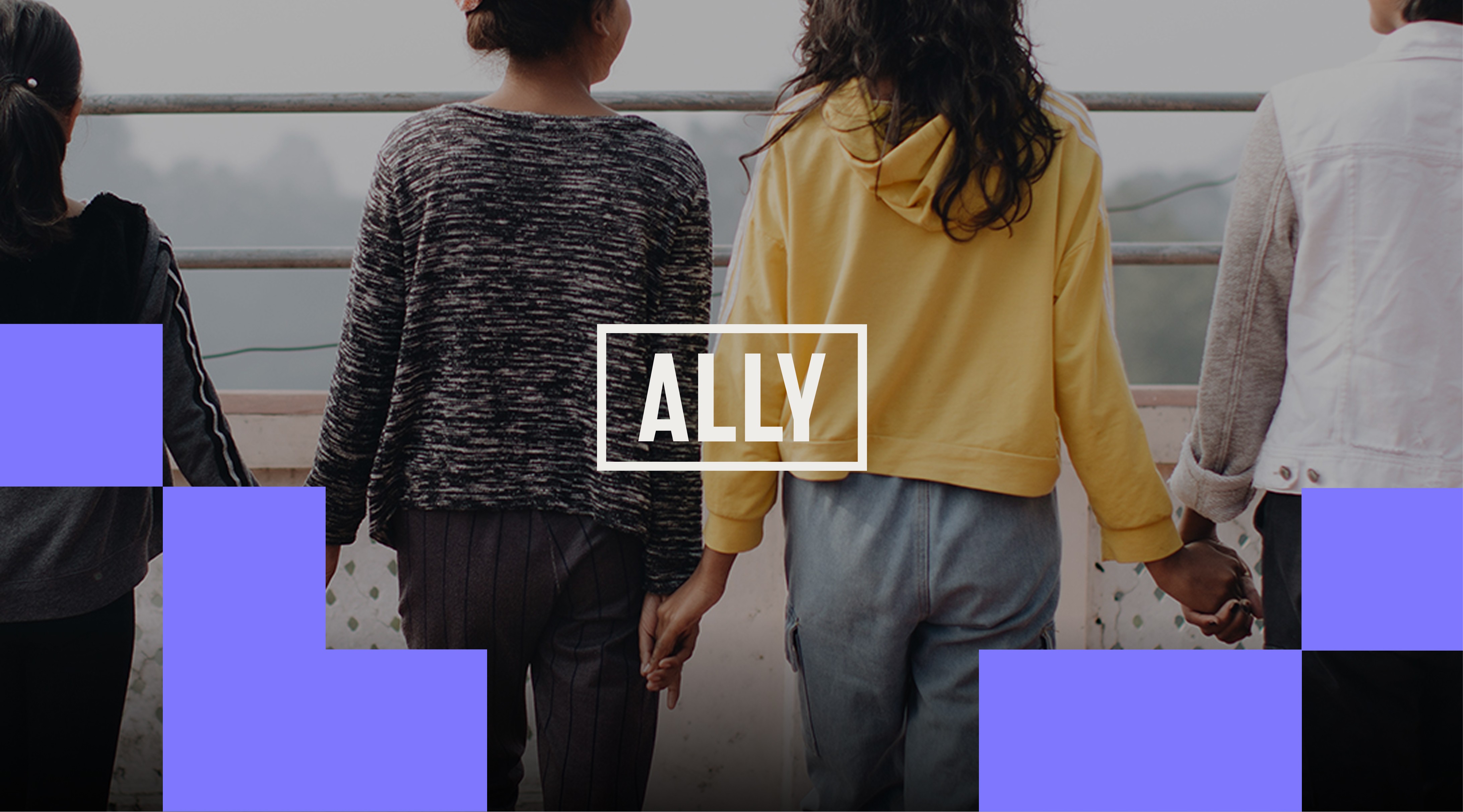
Ally Global Foundation
Redesigning a nonprofit brand identity system to reflect its new positioning and global presence.
Sector: Nonprofit & Social Impact

Nature's Touch
Designing a scalable web experience for the world's largest supplier of frozen fruits and vegetables.
Sector: Food Manufacturing (CPG)
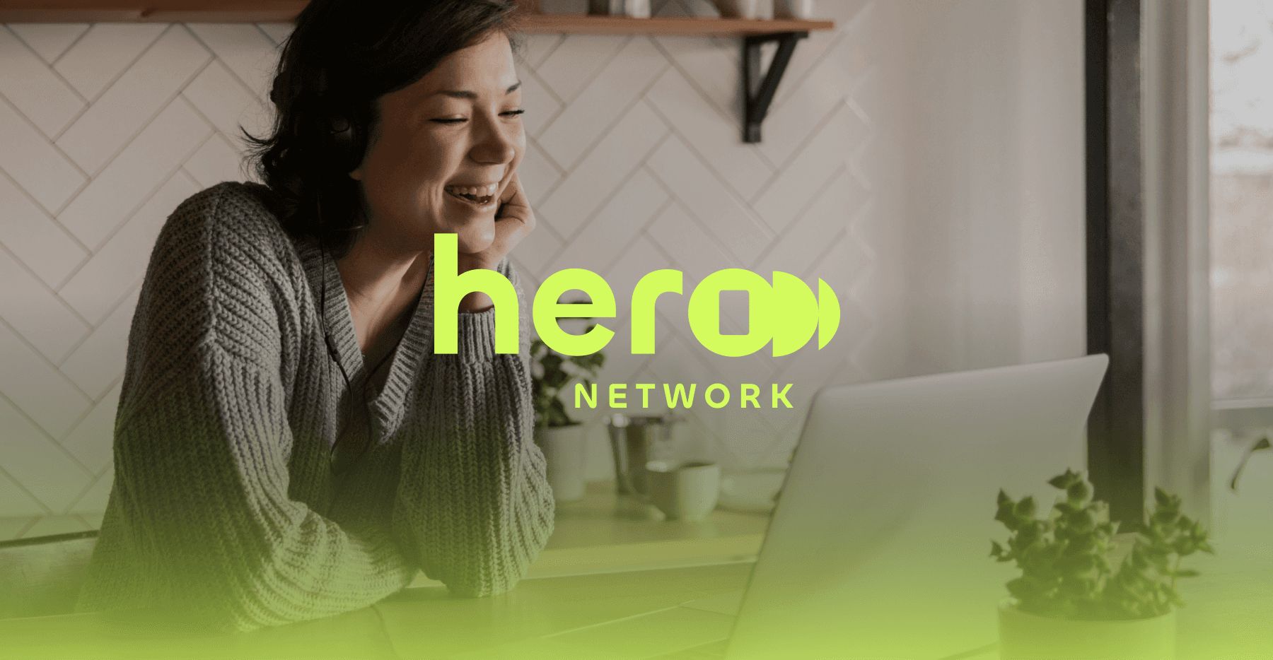
Hero Network
Developing a foundational brand system and visual language for a media-tech storytelling venture.
Sector: Media-Tech

Trinity Western University
Designing a cohesive institutional brand system and visual language for a leading Christian university.
Sector: Higher Education
See Other Projects
Greencoast Power
Repositioning a solar energy and electrical company through brand and web transformation.
Sector: Renewable Energy & Electrical Infrastructure
Ally Global Foundation
Redesigning a nonprofit brand identity system to reflect its new positioning and global presence.
Sector: Nonprofit & Social Impact
Nature's Touch
Designing a scalable web experience for the world's largest supplier of frozen fruits and vegetables.
Sector: Food Manufacturing (CPG)
Hero Network
Developing a foundational brand system and visual language for a media-tech storytelling venture.
Sector: Media-Tech
Trinity Western University
Designing a cohesive institutional brand system and visual language for a leading Christian university.
Sector: Higher Education
Every brand and growth stage is different.
Transformation starts with a conversation.
I collaborate with founders, teams, and agencies across branding, design and web experiences.
© 2026 . Gui de Freitas — Proudly 🇧🇷 Brazilian by birth, 🇨🇦 Canadian by path. Collaborating with brands and teams worldwide 🌎.