Brand Partner
Positioning | Identity Systems | Web Experiences
*
GUI—DE—FREITAS
Trinity Western University
Trinity Western University
Designing a cohesive institutional brand system and visual language for a leading Christian university.
Designing a cohesive institutional brand system and visual language for a leading Christian university.
Designing a cohesive institutional brand system and visual language for a leading Christian university.
Agency Lead:
Veto Creative Agency
Role:
Brand Identity Direction & Design Lead
Scope:
Brand Redesign
Identity System
Visual Language
Brand Expressions
Web & Digital Direction
Content Navigation:
A university is not a brand. It’s an ecosystem.
A university is not a brand. It’s an ecosystem.
A university is not a brand. It’s an ecosystem.
Trinity Western University engaged Veto to lead a comprehensive brand repositioning—clarifying how the institution expresses its mission, promise, and identity in a cohesive way.
At the heart of the brief was a clear objective: unify expression. The university was operating with multiple internal brands, variations of the logo in circulation, and inconsistent visual language across departments .
The opportunity wasn’t cosmetic. It was structural.
Within Veto’s repositioning framework, my role centred on leading the creative development of the identity system—translating strategy into a disciplined, scalable visual architecture that could support the university across faculties, institutes, athletics, digital platforms, and ceremonial contexts.

Higher education institutions operate at a level of complexity few brands encounter.
Trinity Western needed to balance:
- Academic credibility and theological foundation
- Tradition and modern relevance
- Central authority and departmental autonomy
- Formal ceremonial heritage and everyday student communication
The updated logo had already been approved prior to my involvement. But without a cohesive system surrounding it, the mark alone could not create consistency.
The real challenge was to build governance around expression—so that every school, department, document, and digital interface could speak with the power of "one voice”.
Previous Branding
Previous Branding

The work began by aligning identity with institutional philosophy.
The university’s theological foundation—rooted in the Trinity—became more than symbolism. The “Power of Three” principle informed messaging structure, visual composition, and system logic. The flame mark itself embodied this foundation, serving as both spiritual anchor and visual signature.


With strategy guiding, the identity expanded into a comprehensive and intentional system.
A refined logo architecture introduced primary, secondary, and tertiary signatures to ensure flexibility across contexts. Sub-brand lockups were developed for schools, faculties, institutes, and centres—bringing coherence to what had previously felt fragmented.
A disciplined colour hierarchy anchored in Trinity Blue and Golden Lights created institutional authority, while secondary tones allowed flexibility across audiences and applications .
Typography was structured to balance academic sophistication with contemporary clarity, using a deliberate serif–sans pairing that reinforced hierarchy and readability .
Rather than creating isolated assets, the goal was to build a system that could scale.


The identity system was designed to operate across every layer of the university.
It extended from formal elements such as crest, medallion, and coat of arms governance, to everyday materials including stationery, email signatures, merchandise, signage, and fleet applications.
The final brand book became not simply a guideline document, but an operational framework—clarifying how the university appears, speaks, and evolves.


The system informed the visual direction of the university’s website, ensuring digital presence aligned with institutional tone. Environmental graphics and campus applications reinforced cohesion in physical space, while photography and videography guidelines established a consistent emotional language for storytelling.
The system informed the visual direction of the university’s website, ensuring digital presence aligned with institutional tone. Environmental graphics and campus applications reinforced cohesion in physical space, while photography and videography guidelines established a consistent emotional language for storytelling.
The system informed the visual direction of the university’s website, ensuring digital presence aligned with institutional tone. Environmental graphics and campus applications reinforced cohesion in physical space, while photography and videography guidelines established a consistent emotional language for storytelling.

The work culminated in the launch campaign built around the university’s central promise: “Equipped for Life.”
This campaign translated strategy into lived expression. Through large-scale environmental applications, digital rollouts, printed materials, and campus presence, the system moved from governance to visibility—reinforcing the idea that every graduate is equipped to think truthfully, act justly, and live faithfully.
Rather than functioning as a temporary marketing layer, the campaign demonstrated the strength of the identity architecture. It showed how the brand could communicate boldly, consistently, and with institutional confidence—across mediums and audiences.


This work established a unified visual foundation for Trinity Western University—aligning mission, promise, identity and expression into one cohesive system.
It provided:
- Clear governance for internal stakeholders
- Scalable architecture for long-term growth
- Consistency across academic, ceremonial, and digital contexts
- Elevated institutional presence
Branding for higher education requires more than creativity. It requires structure, stewardship, and the ability to translate philosophy into disciplined systems.
The result is a brand system capable of supporting a complex, global institution for years to come.
I help founders and teams that are serious about their business growth to leverage brand power for what's next: a launch, a pitch, or a new phase of growth.
See Other Projects

Greencoast Power
Repositioning a solar energy and electrical company through brand and web transformation.
Sector: Renewable Energy & Electrical Infrastructure
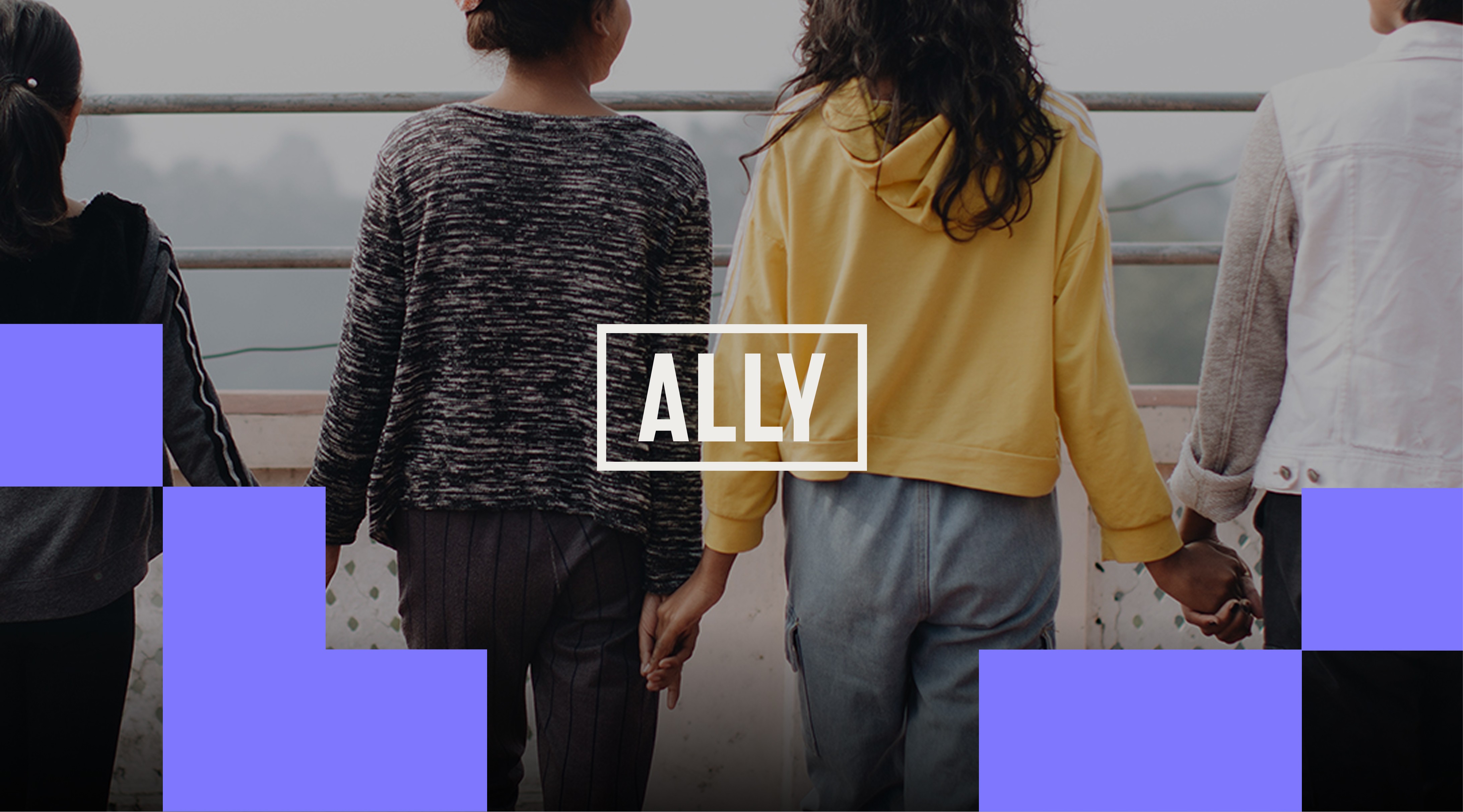
Ally Global Foundation
Redesigning a nonprofit brand identity system to reflect its new positioning and global presence.
Sector: Nonprofit & Social Impact

Nature's Touch
Designing a scalable web experience for the world's largest supplier of frozen fruits and vegetables.
Sector: Food Manufacturing (CPG)

Hero Network
Developing a foundational brand system and visual language for a media-tech storytelling venture.
Sector: Media-Tech
Veto Creative Agency
Repositioning and redesigning a creative agency brand to elevate perception, clarity, and competitive positioning.
Sector: Advertising & Creative Services
See Other Projects
Greencoast Power
Repositioning a solar energy and electrical company through brand and web transformation.
Sector: Renewable Energy & Electrical Infrastructure
Ally Global Foundation
Redesigning a nonprofit brand identity system to reflect its new positioning and global presence.
Sector: Nonprofit & Social Impact
Nature's Touch
Designing a scalable web experience for the world's largest supplier of frozen fruits and vegetables.
Sector: Food Manufacturing (CPG)
Hero Network
Developing a foundational brand system and visual language for a media-tech storytelling venture.
Sector: Media-Tech
Veto Creative Agency
Repositioning and redesigning a creative agency brand to elevate perception, clarity, and competitive positioning.
Sector: Advertising & Creative Services
Every brand and growth stage is different.
Transformation starts with a conversation.
I collaborate with founders, teams, and agencies across branding, design and web experiences.
© 2026 . Gui de Freitas — Proudly 🇧🇷 Brazilian by birth, 🇨🇦 Canadian by path. Collaborating with brands and teams worldwide 🌎.