Brand Partner
Positioning | Identity Systems | Web Experiences
*
GUI—DE—FREITAS
Nature's Touch
Nature's Touch
Enterprise-level website redesign translating new positioning into a scalable digital presence.
Enterprise-level website redesign translating new positioning into a scalable digital presence.
Enterprise-level website redesign translating new positioning into a scalable digital presence.
Agency Lead:
Crew Marketing Partners
Role:
Independent Web Experience & Design Partner
Scope:
Web Experience
UX/UI Design
Scalable Design System
Content Navigation:
A digital transformation designed to reflect identity, scale, and credibility.
A digital transformation designed to reflect identity, scale, and credibility.
A digital transformation designed to reflect identity, scale, and credibility.
Nature’s Touch had recently undergone an in-depth strategic repositioning and full brand identity redesign, redefining its voice, visual language, and packaging system.
As the world’s largest supplier of frozen fruits and vegetables, the company operates at significant global scale — serving both retail consumers and private label partners. However, its previous website did not reflect the strength of the new brand direction, nor the weight of its market presence.
The digital platform needed to evolve from a functional website into a strategic expression of scale, purpose, and authority.
Previous Website
Previous Website

The project required translating a comprehensive brand transformation into a digital experience capable of serving distinct audiences with different expectations.
The website needed to:
- Communicate clearly to both B2C and B2B segments
- Reflect the company’s global scale and operational sophistication
- Showcase products, sourcing, and processes with transparency
- Balance emotional connection with corporate credibility
- Support a large and layered information architecture across ~20+ pages
This was not a cosmetic redesign.
It was the creation of a scalable digital ecosystem aligned with a new brand phase.

The web strategy phase — led by Crew Marketing Partners in collaboration with Nature’s Touch — established the core site structure, audience segmentation, and information architecture.
My role began with defining creative and experiential directions capable of translating the newly developed brand system into a cohesive digital language.


Working closely with both teams, the focus became clear: Create a digital experience that feels elevated and confident — while remaining accessible, purposeful, and deeply rooted in the brand’s connection to nature.
The direction adopted emphasized:
- Tasteful, confident use of colour
- Bold yet approachable typography
- Structured content hierarchy for layered information
- Photography and video that express freshness, sourcing integrity, and product quality
The experience needed to signal scale — without losing warmth.


Photography and video play a central role throughout the experience — showcasing product quality, supply chain integrity, and the brand’s commitment to shaping a food system that serves both people and the planet.
The platform was designed to:
- Function seamlessly across devices
- Maintain accessibility standards
- Support future growth and content expansion
- Adapt to both consumer storytelling and private label partnership communication


The website was built as a flexible, scalable system rather than a collection of pages.
A clean and elevated design language integrates brand colours and graphic elements while maintaining clarity across complex content layers. Typography was structured to handle both storytelling and technical information — supporting readability at every level.
Motion and micro-interactions were introduced intentionally, adding dynamism without undermining corporate credibility. Subtle transitions and layered interactions create engagement while reinforcing professionalism.


The new website aligns Nature’s Touch’s digital presence with its global scale and renewed strategic positioning.
The brand now communicates:
- Greater authority and credibility in the global food industry
- Clearer audience segmentation between consumer and business stakeholders
- Stronger alignment between purpose-driven messaging and operational sophistication
- A scalable digital foundation built for long-term growth
For global brands operating at scale, digital presence is not simply communication — it is infrastructure.
Nature’s Touch now has a web experience that reflects its impact, supports its growth, and translates its purpose into a system designed for the future.
I help founders and teams that are serious about their business growth to leverage brand power for what's next: a launch, a pitch, or a new phase of growth.
See Other Projects

Greencoast Power
Repositioning a solar energy and electrical company through brand and web transformation.
Sector: Renewable Energy & Electrical Infrastructure
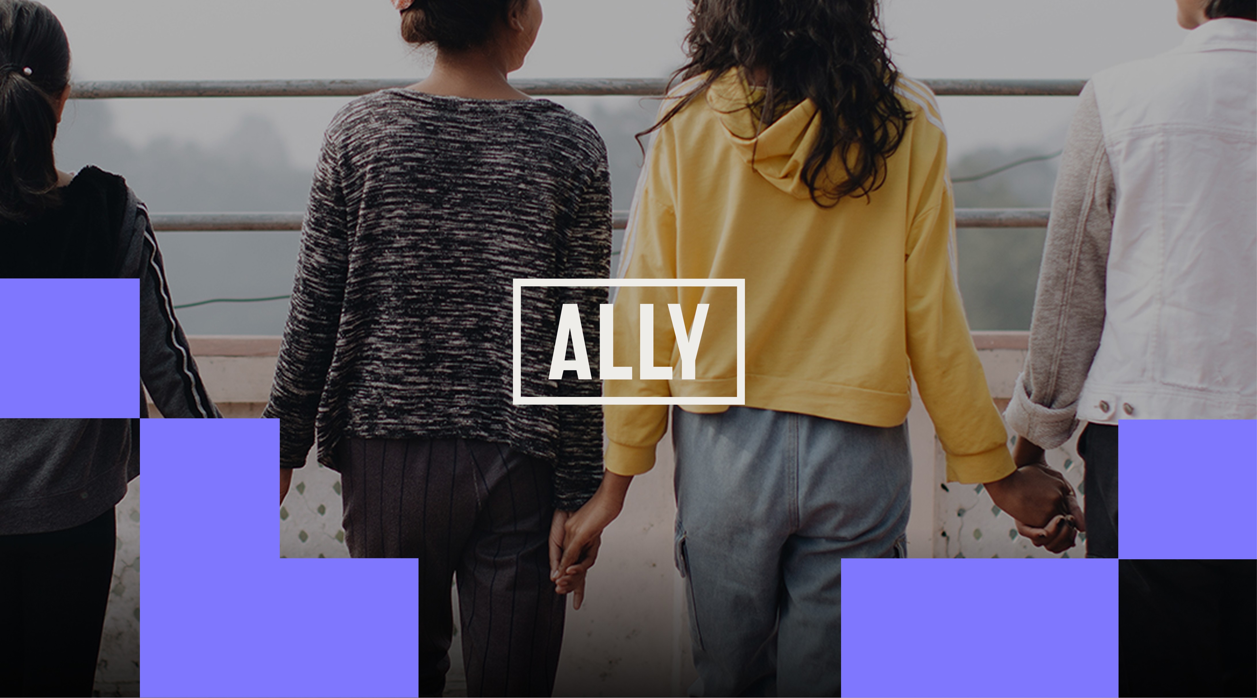
Ally Global Foundation
Redesigning a nonprofit brand identity system to reflect its new positioning and global presence.
Sector: Nonprofit & Social Impact
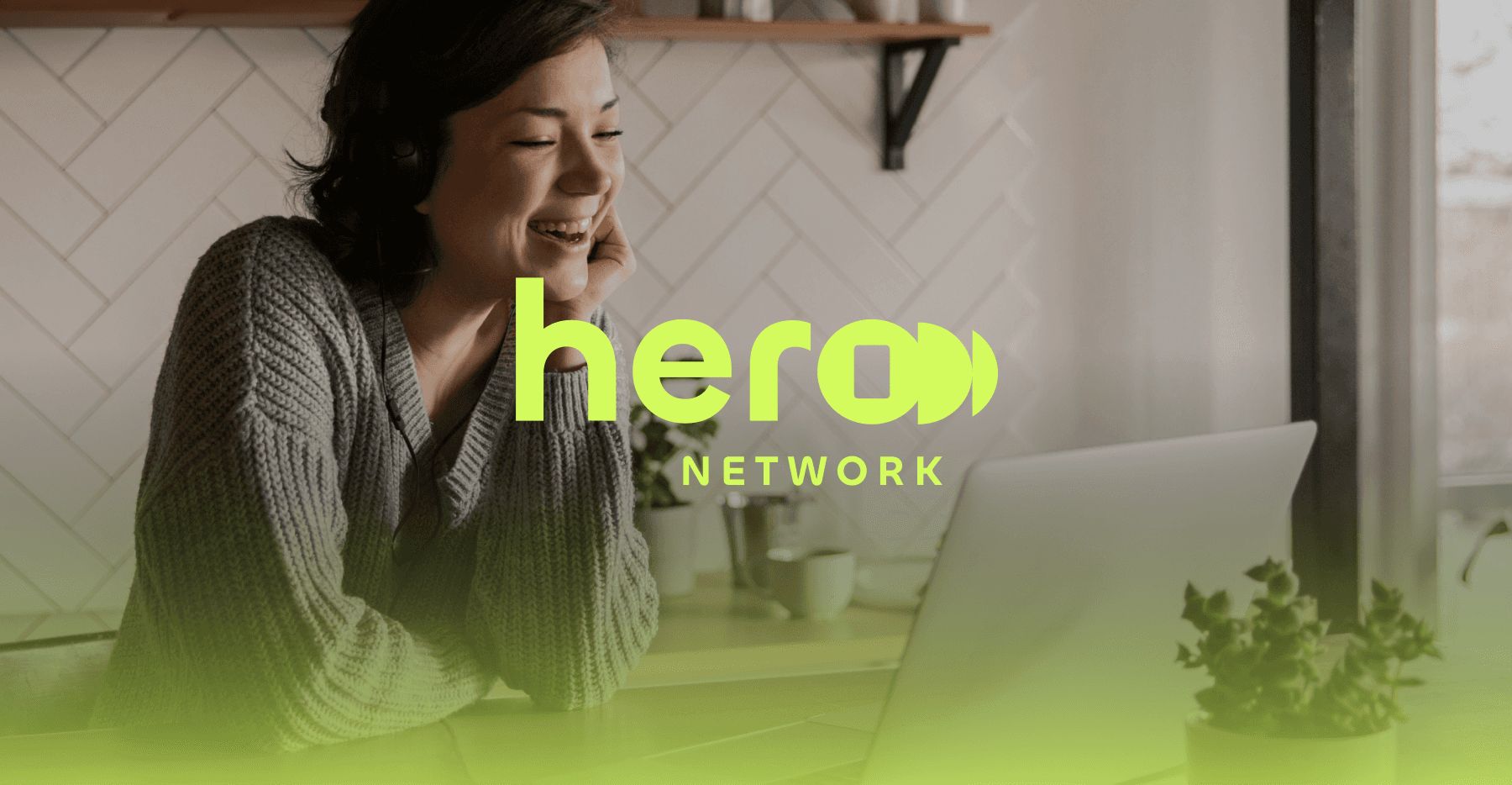
Hero Network
Developing a foundational brand system and visual language for a media-tech storytelling venture.
Sector: Media-Tech
Trinity Western University
Designing a cohesive institutional brand system and visual language for a leading Christian university.
Sector: Higher Education
Veto Creative Agency
Repositioning and redesigning a creative agency brand to elevate perception, clarity, and competitive positioning.
Sector: Advertising & Creative Services
See Other Projects
Greencoast Power
Repositioning a solar energy and electrical company through brand and web transformation.
Sector: Renewable Energy & Electrical Infrastructure
Ally Global Foundation
Redesigning a nonprofit brand identity system to reflect its new positioning and global presence.
Sector: Nonprofit & Social Impact
Hero Network
Developing a foundational brand system and visual language for a media-tech storytelling venture.
Sector: Media-Tech
Trinity Western University
Designing a cohesive institutional brand system and visual language for a leading Christian university.
Sector: Higher Education
Veto Creative Agency
Repositioning and redesigning a creative agency brand to elevate perception, clarity, and competitive positioning.
Sector: Advertising & Creative Services
Every brand and growth stage is different.
Transformation starts with a conversation.
I collaborate with founders, teams, and agencies across branding, design and web experiences.
© 2026 . Gui de Freitas — Proudly 🇧🇷 Brazilian by birth, 🇨🇦 Canadian by path. Collaborating with brands and teams worldwide 🌎.